PROJECT
Go back home
B2C SaaS Neo Banking
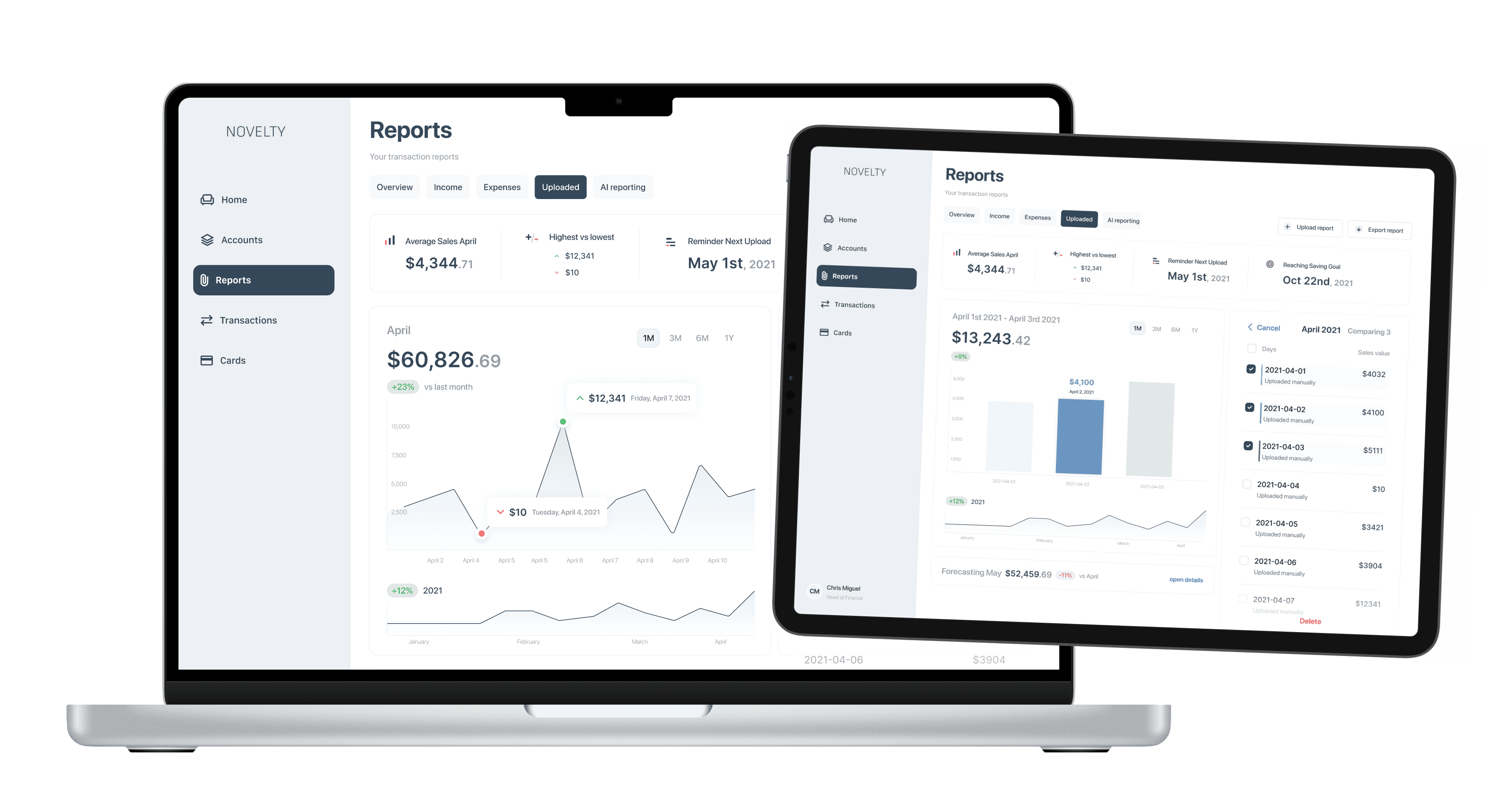
Novelty Finance is a FinTech SaaS that has a full service approach. Their product is a desktop-first platform. Based on some prior user research they are planning to add a new feature that would answer usersʼ needs. One requirement is to enable users, adding third party data. Here is the approach.
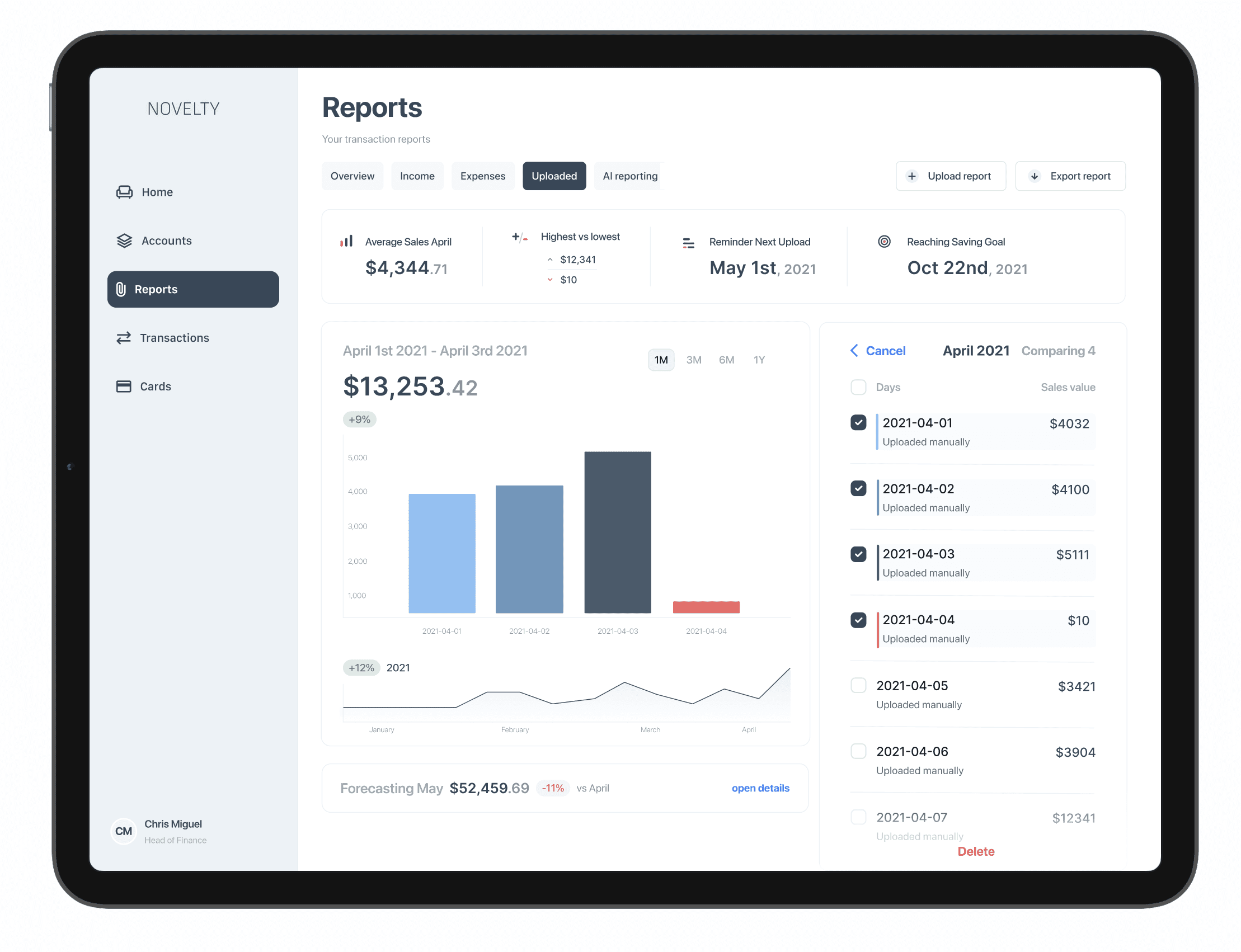
As long as the third party does not provide an API, users need to upload CSV files manually. This should be an easy and safe task. There are three main features to consider: uploading, visualizing and comparing data. Understanding the underlying motivation behind these requirements and building empathy is the first step.

Thoughts on real user needs
The idea of requirements is to eventually build a solution. For that part the requirement needs to be bullet proof. The critical step between real user needs and the actual stories is first being reviewed by me. I challenge by asking questions: why does the user need to manually upload stuff? Why isn't there an API provided? A story only tells a narrow solution - PM and research need to make sure to find the best possible solution, in terms of business resources and user experience.
Once the requirements are safe, mapping some key interaction to focus on important steps
There is a certain magic when it comes to mapping key requirements onto what we think are the users. Most requirements are easy to build, because they follow already known patterns to most of the user groups. We wanted to find the edges of the matrix. What user groups has issues with what key requirement? That is where design needs to happen.


The prototyping phase helped to find the unknown blind spots.
If there are requirements, there are always different views to one solution. With quick prototyping (create/test) sessions I made sure that I had a proper approach, that actually supports users to archive their goals easily and safely.
A majority of design the effort was spent on the easy to scan and read typography. Since this app is about financial data, the reading and scanning capabilities for digits was high priority. Here I chose the Inter for digits and the SF Pro Display for the text.

Data Visualization Approach

Make it count
For sales data, a sequential color scale might be appropriate if you're highlighting differences in sales figures over time or across regions, emphasizing a low-to-high continuum.

Overview first
2. Zoom and Filter
3. Details on Demand
I am a big fan of Schneiderman's Mantra - he is the go to, when it comes to creating an order for users, working with a large amount of data.
UI Interaction
A good interface is only as good as the actual interactions. Designing a mental model for a safe use of financial data is a crucial step in the design process. Know where you came from, where you are at and where to go from here.

I really liked to build this product
Many more things are there to discover. How to test and develop the design, engineering and design success indicators, etc
Let's talk : )
2023
Berlin